
(This story first appeared in the November-December issue of MJBizMagazine.)
A strong brand can give companies name recognition and longevity – a key consideration for marijuana companies as they expand into states with newly regulated markets.
Businesses undergo rebranding for myriad reasons, but getting it right is challenging, said Elizabeth Corbett, vice president of sales at AE Global, a Florida-based packaging solutions company that helps cannabis operators with rebranding.

Corbett said companies rebrand for four main reasons:
- They’re repositioning the brand to better reflect its spirit and identity.
- The brand has become stale and needs a refresh.
- The product has changed in terms of its ingredients, efficacy or characteristics.
- The company is addressing sustainability – either through the product itself or its packaging, which can significantly change the look and feel of a brand.
“As the cannabis industry becomes more mature, particularly in states such as California, the market has become saturated and very competitive,” Corbett said.
“Getting the right branding and packaging design is an absolute must in order to separate yourself from the crowd and drive revenue.”
MJBizMagazine spoke with companies that recently underwent a rebrand. Here’s what they had to say:
Change in Rhythm
San Francisco-based Rhythm launched a line of hemp-derived, CBD-infused beverages in August 2020.
The company originally offered its products exclusively online through direct-to-consumer sales but has since expanded to include more than 40 wholesale distribution points in five states.
The company’s original packaging was designed by one of its founders, who had a background in graphic design.
But after more than a year of sales and listening to customer feedback, the company determined it needed a new look that would give consumers product information in an easily digestible way, co-founder and CEO Ian Monat said.
The company worked with Voicebox Creative, a Bay Area branding and packaging-design agency, to refresh the identity and create a more memorable presentation.
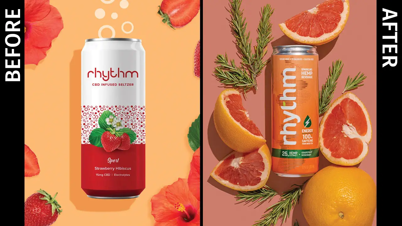
Rhythm’s original packaging looked like a hard seltzer, giving consumers the impression that it contained alcohol rather than CBD.
Post-rebrand, Rhythm comes in brightly colored cans with the words “Sparkling Hemp Beverage” displayed at the top and the product’s intended purpose – Energy, Hydrate, Recover, Sleep – next to the brand name and flavor.
“We flipped the order of importance,” Monat said. “We pulled the fruit (image) off and promoted the functionality of the beverage.
“If all you see is a strawberry on the can, you don’t know about the magnesium or B vitamins.”
Rhythm also changed what it was calling the “effects” for three of its four beverages: Dream became Sleep, Awake became Energy and Sport became Hydrate. Iconography illustrates the products’ functionality: Sleep has a moon and stars; Hydrate has a runner and Energy is depicted by a lightning bolt.
Escaping an old look
Denver-based Escape Artists – a marijuana manufacturing company that offers pre-rolls, tinctures and topicals – revamped its image to ensure its products stand out as the brand expands into new markets.
For now, the company is focused on regulated Midwest and southwestern markets and has plans to expand to both coasts.
“As we get ready to expand into new markets, I’m excited to get our topicals on shelves all over the country,” Escape Artists CEO Alison Di Spaltro said.
When Escape Artists rebranded, it took the opportunity to improve the sustainability of its packaging while increasing its visibility on store shelves.
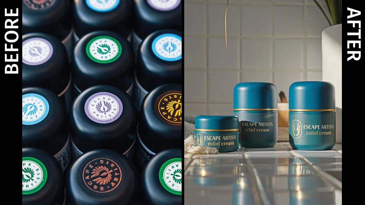
Packaging that was once black and white is now teal and gold. Elements are carried across Escape Artists’ product lines to give the brand a more cohesive look.
“It’s not bright and in your face, but it’s recognizable, even down to how we laid out the labels and the font,” Di Spaltro said.
“There’s a lot of required information (on regulated marijuana products). We think the layout and the way we presented it is easier to understand.”
In terms of sustainability, Escape Artists’ glass jars, plastic lids and pre-roll tubes are recyclable. The company also moved to a domestic producer for its exterior boxes, which are made of recyclable cardboard paper.
“The box is to protect the product,” Di Spaltro said. “It’s on bumpy vans (during transport), and jars bounce around and might brush off some of the content on the labels. We’ve done tests without boxes, and they often get banged up without a protective layer.”
Navigating the Canna River
Thousand Oaks, California-based Canna River’s rebrand took the image for its CBD products from earthy and rustic to vibrant and colorful – a move the company says helped boost sales by 134%.
When Canna River launched its earthy, industrial packaging in 2019, it exclusively offered hemp-derived products.
The rebrand coincides with Canna River’s introduction of six new collections that include delta-8 THC, delta-9 THC and hexahydrocannabinol (or HHC) products – another likely reason sales spiked.
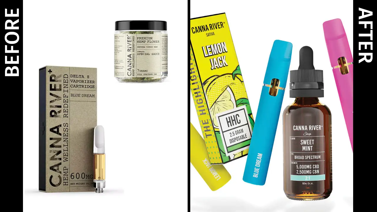
“We found that the rustic look wasn’t truly speaking to a broad range of cannabinoid users,” said Amanda Wallace, the company’s chief marketing officer. “It felt very hippyish or industrial-rustic.”
Wallace said the pop art-inspired packaging targets a broader audience with its cheery, bright aesthetic. “Cannabinoids are supposed to be happy,” she added.
Although the language on the packaging hasn’t changed, the design is more focused on showcasing the strength of Canna River’s products by increasing the font size for how much of each cannabinoid is used.
“Our competitors’ products are half the strength and double the money,” Wallace said, adding that Canna River’s products are all priced at less than $100.
Cannabis for women
Miss Grass wants to be the brand that women turn to when they’re looking for quality cannabis.
So, when the Venice, California-based company rebranded earlier this year, it looked for ways to break marijuana’s traditional stoner image.
“A lot of these masculine brands have really dark colors, psychedelic graphics and language catered to male stoner bros,” said Priyanka Pulijal, the company’s creative lead.
“It really perpetuates the stigma around weed being something that is used as a drug to escape reality, rather than that more conscious relationship to the plant.”
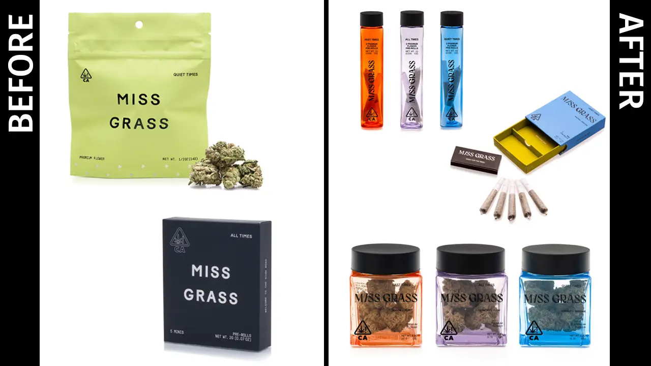
With a woman-centric audience in mind, Miss Grass looked at its neon “party” packaging and determined it needed a change to better reflect the more mature female consumer.
“Women are the fastest-growing consumer segment in this industry and the most underserved,” Pulijal said.
“We’re striving to offer something that taps into this femininity and breaks the traditional stoner trope. This is an opportunity to own what feminine energy looks like to us through packaging colors and expressions.”
Color was key to bringing the idea to life.
The goal for Miss Grass’ new color-coded packaging is to reflect what’s in the jars, tubes and boxes as well as the effect the product will have on the consumer.
For example, the company’s sativa-dominant Fast Times strain comes in blood orange packaging, the thinking being that both the effect and the color elicit feelings of brightness and physicality.
In contrast, the company’s indica-dominant Quiet Times strain is in sapphire blue to give a sense of calm, sensuality and bliss.
“If you focus on an intention with packaging for a greater purpose, it can help debunk the stoner-bro culture and tap into what your audience wants,” Pulijal said.
“It really makes a difference to … be intentional and conscious and set ourselves apart in a male-dominated industry.”